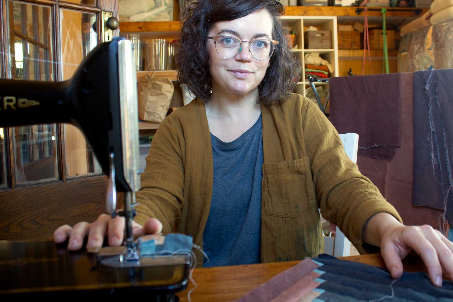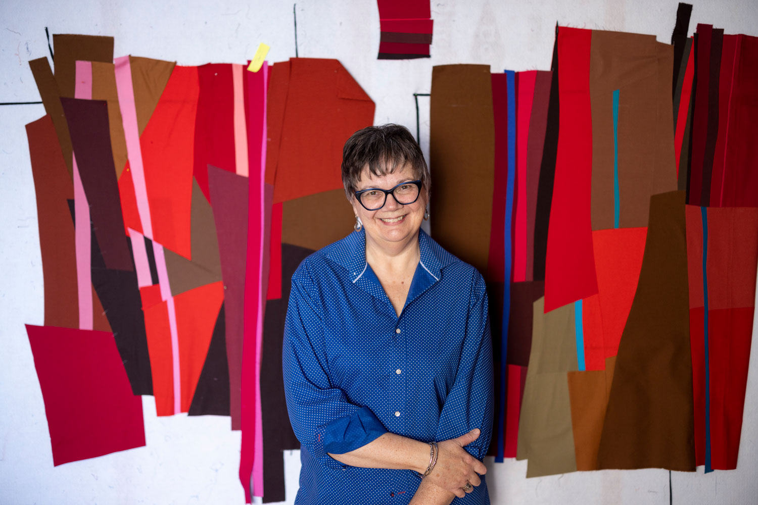
Dale Tomlinson
Quilter
Toronto, Canada
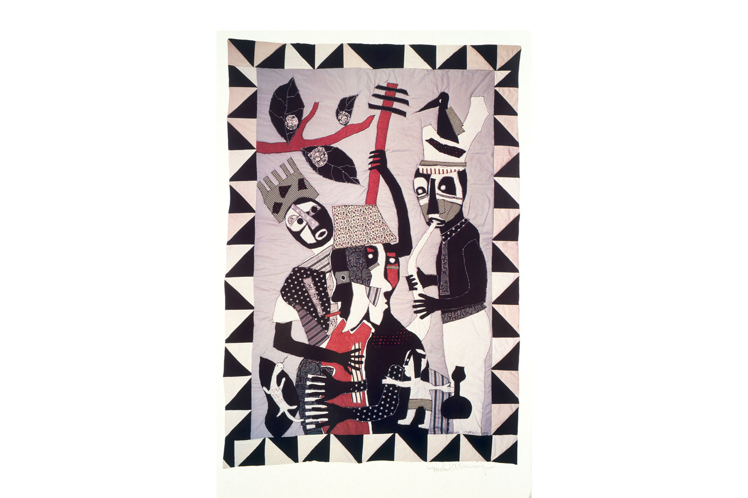
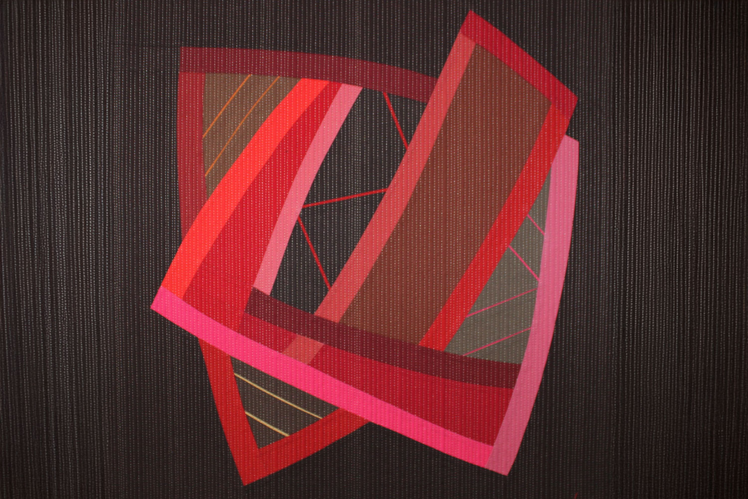
Colour and connection in quilt form
- Dale creates abstract, wall-based quilted art
- Colour is a significant physical and compositional driver
- She favours an improvisational process driven by the piece’s structure and scale
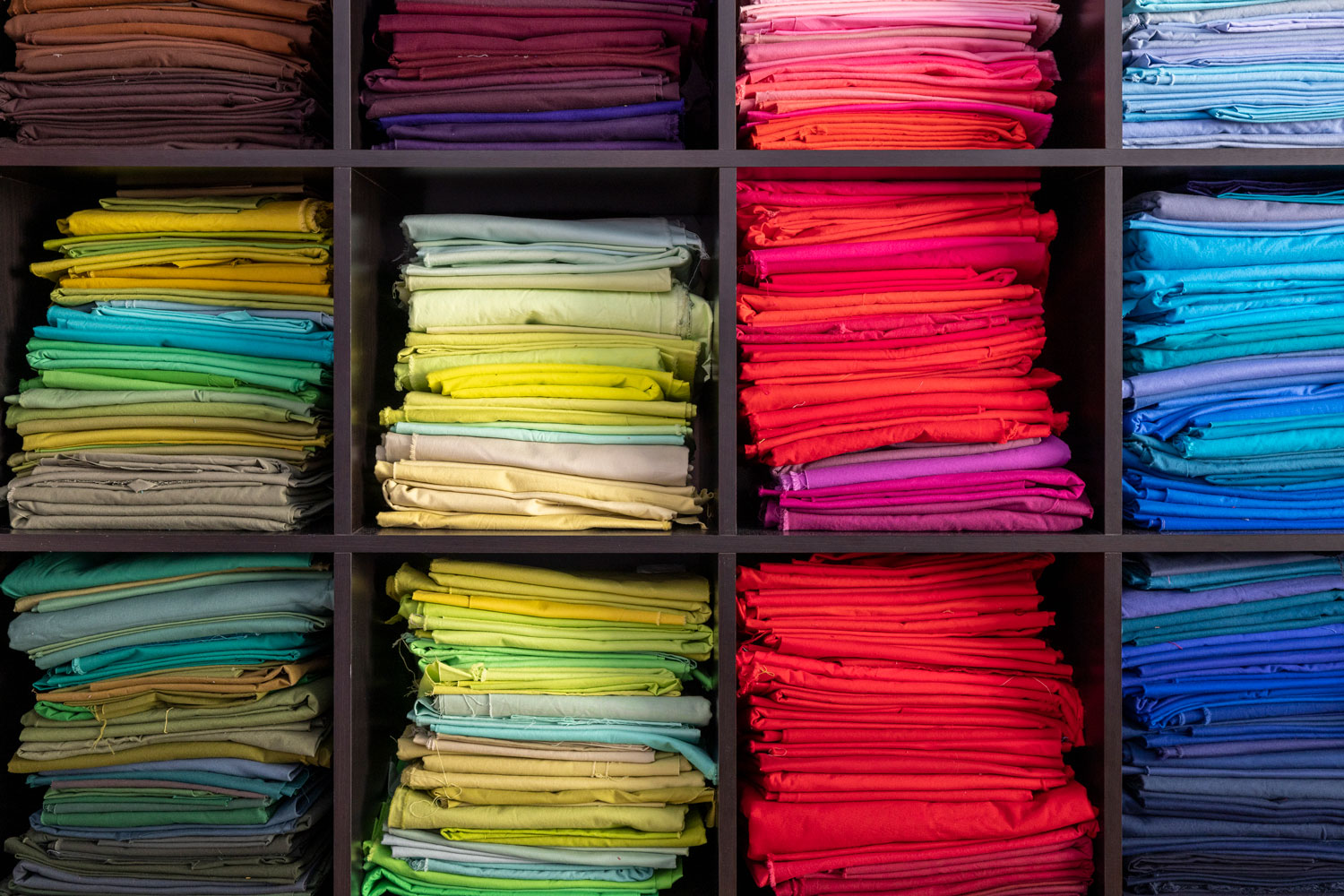
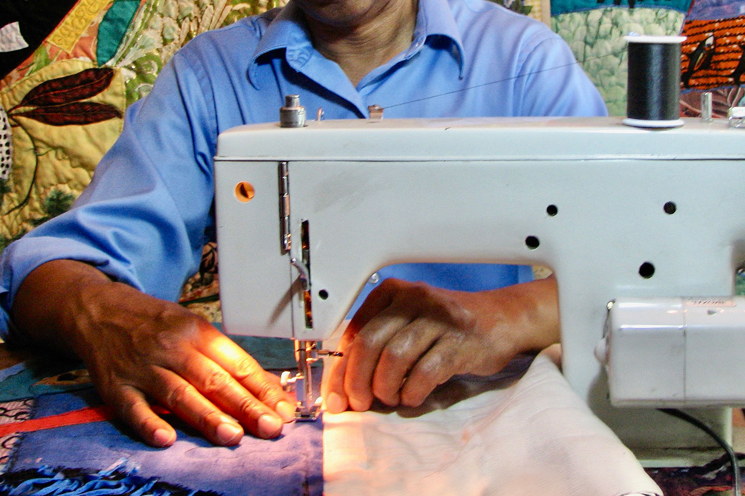
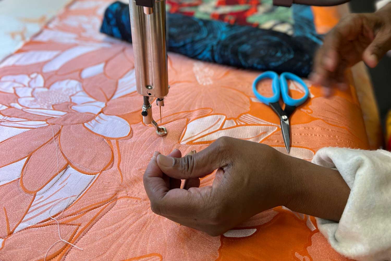
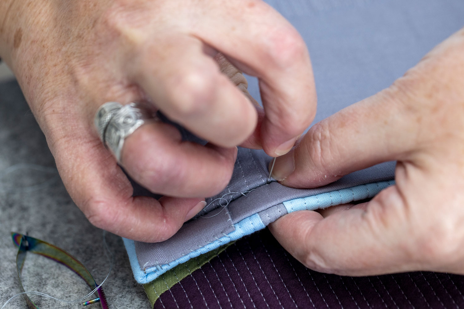
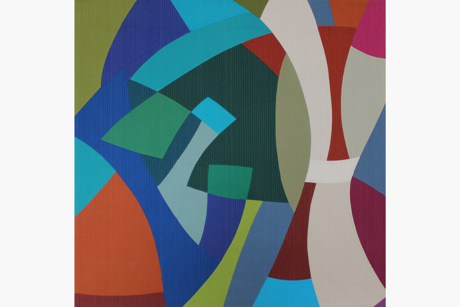
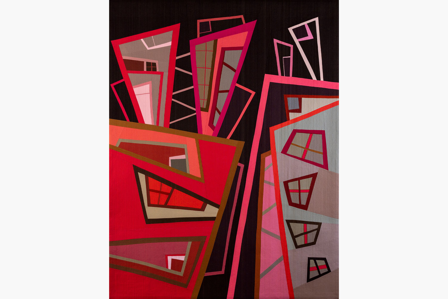
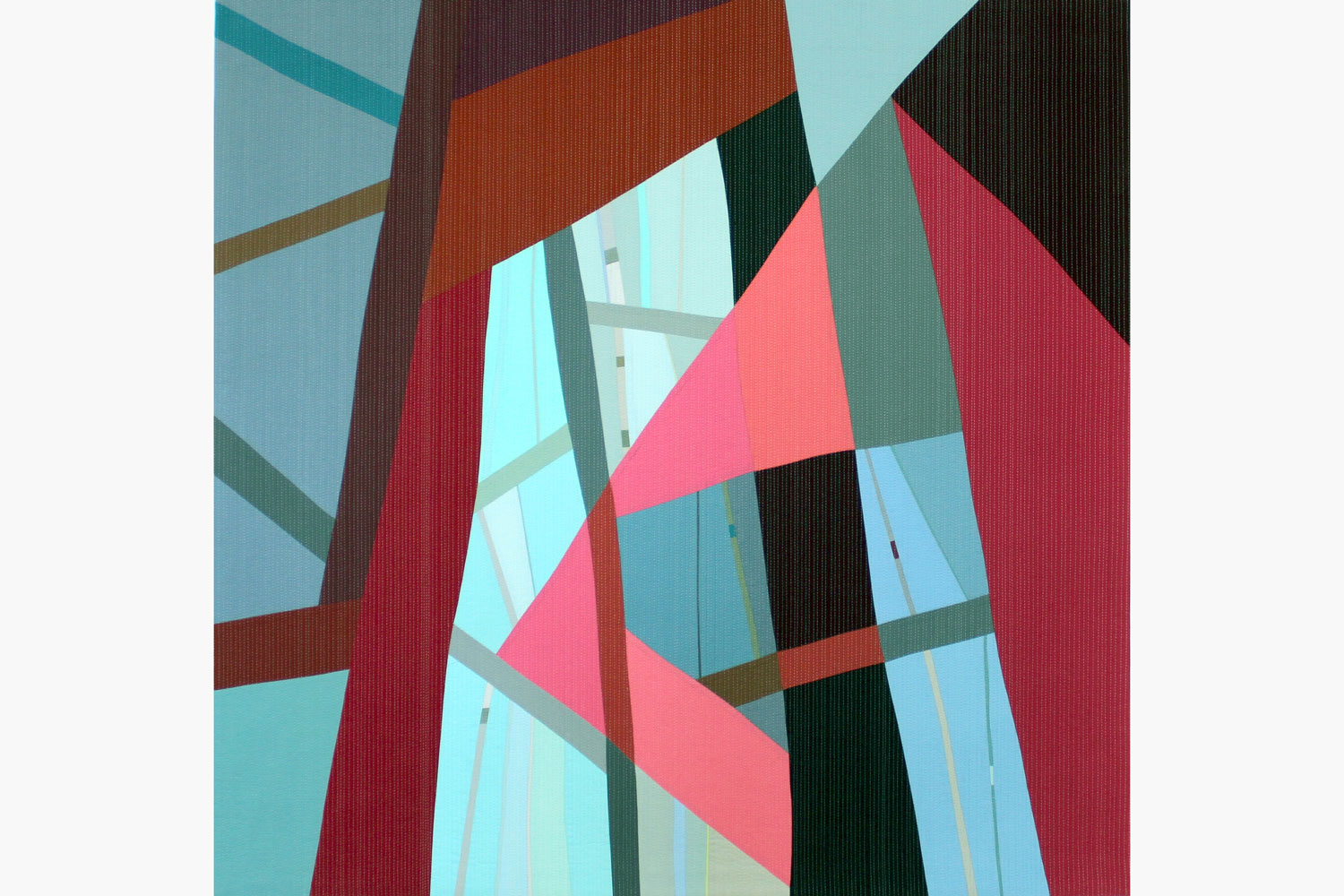
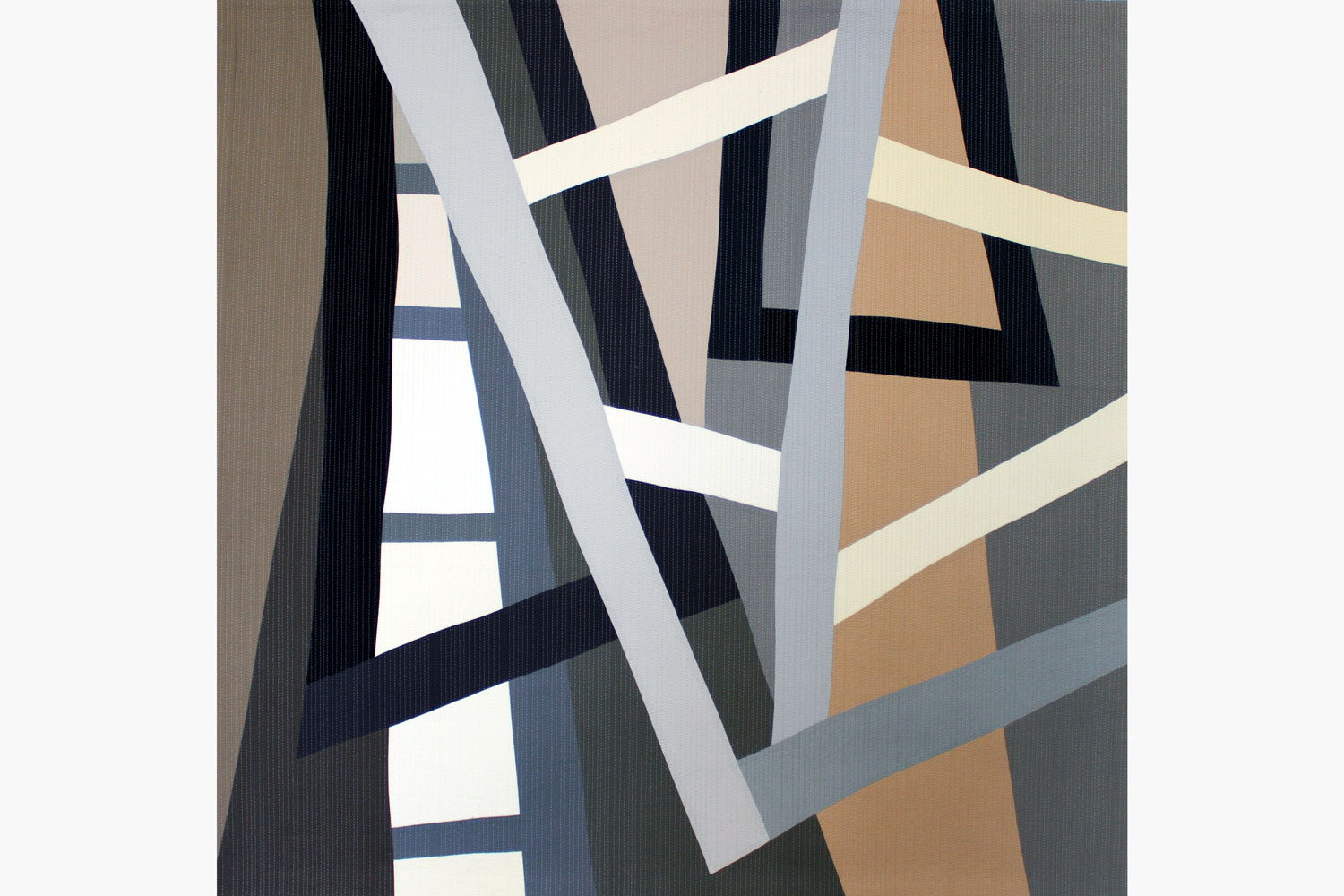
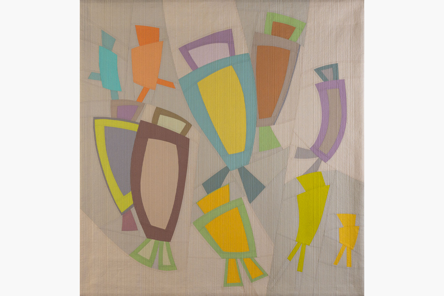
Dale Tomlinson creates large scale quilted pieces conceived as wall art. As part of her practice, she seeks to centre the tradition of quilting in an artistic landscape. “In my mind, fabric-based abstraction should be valued on the same level as painting,” she says. Dale came to quilting after a long career in the non-profit sector, moving to a full-time studio practice in 2019. Her pieces are noted for their use of solid block colour, an interest of hers from a young age. “I learned from my mother to notice subtle variations in greens, clouds and monochrome winter landscapes, developing a deep sensitivity to how colours interact and change in relation to each other,” she says. Long-standing observations of derelict rural buildings inform her current projects as Dale explores how structure, light and decay reshape form over time.
INTERVIEW
I worked for over twenty years at United Way Toronto in national campaign and digital roles. During that time, I quilted alongside my career. After cancer treatment, it became clear I wanted to spend my working life making. I transitioned fully into art in 2019.
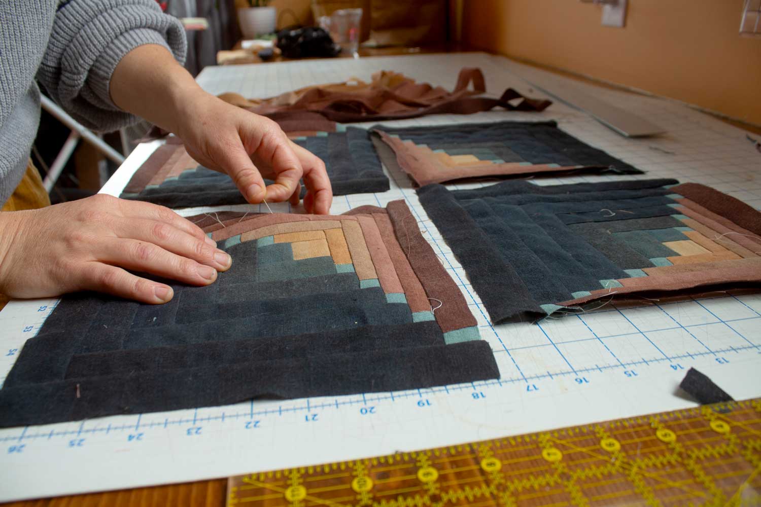
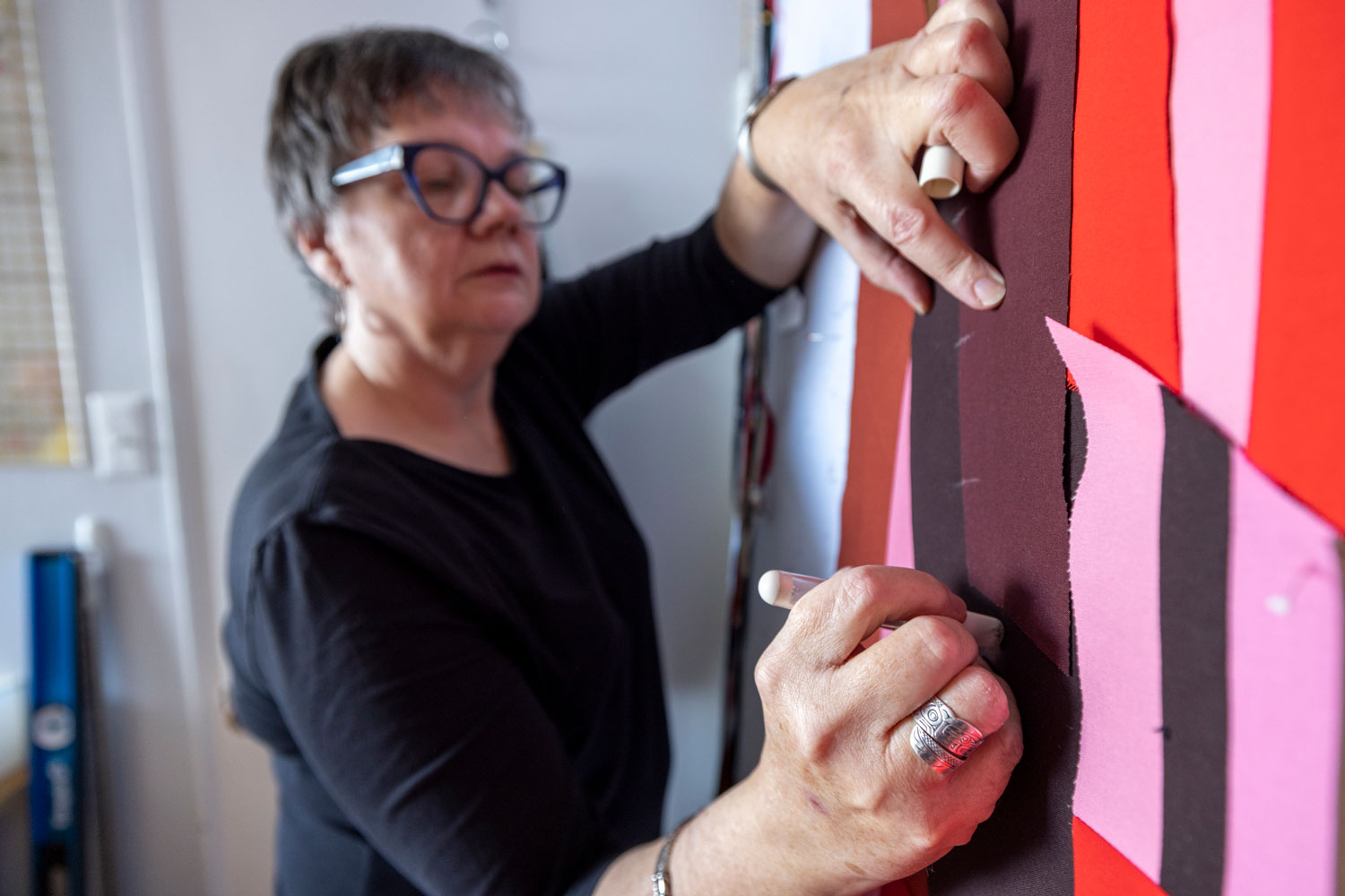
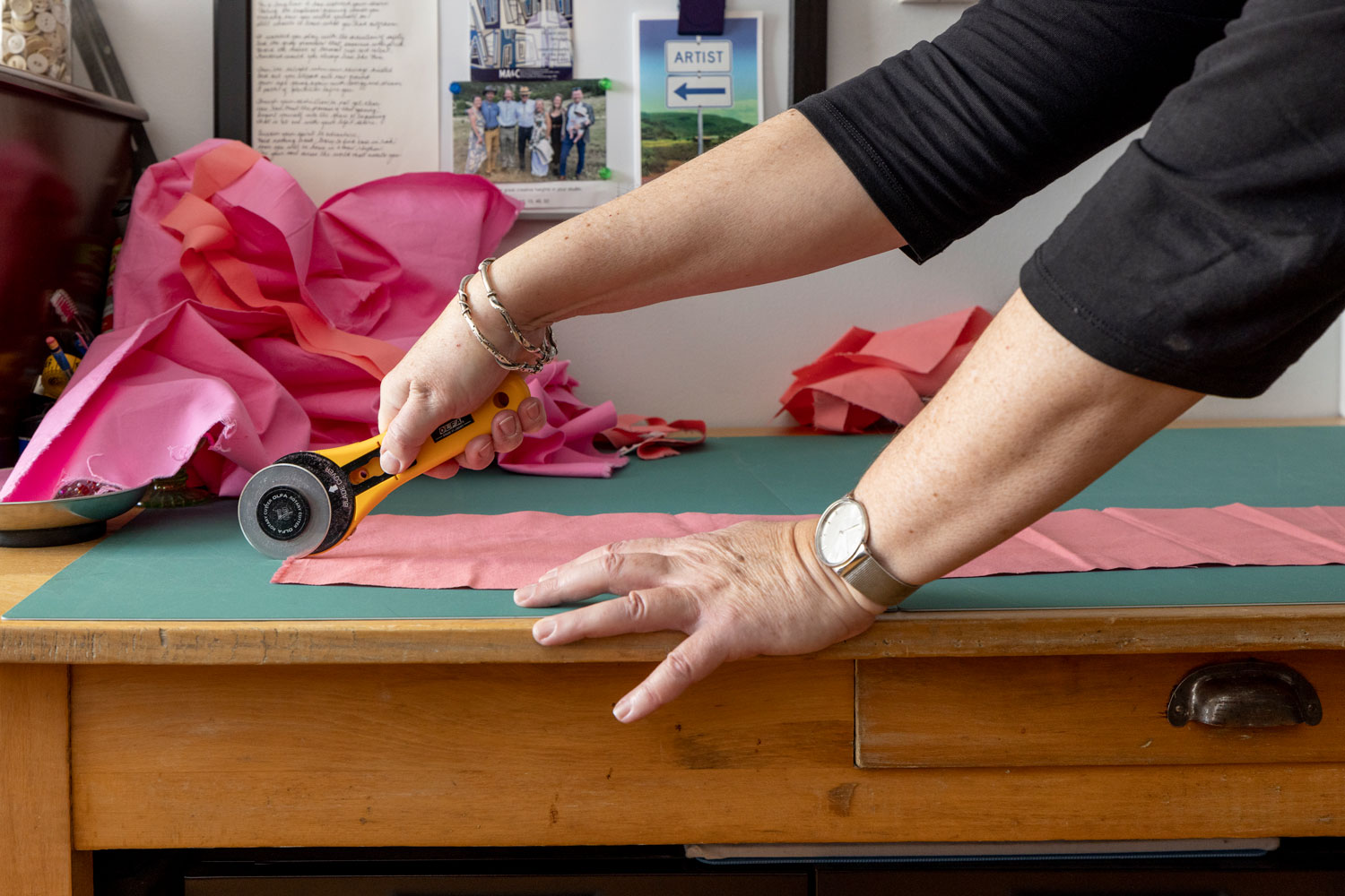
I usually start with size and a loose colour palette. I do not plan the final image in advance. I cut shapes, move them on the wall, discard and recut. The artwork evolves through adjustment rather than following a fixed design.
Colour has always been a strong presence in my life. I respond to it physically. Colours shift depending on what surrounds them, and that interaction drives the work. Even subtle or muted tones can carry weight if used carefully.
The aim is for viewers to notice relationships through repetition, rhythm and proportion, much as they would when standing with a painting in a gallery.