Paolo Roggero & Federico Arzenton
Small Caps
Silk screen printer
Venice, Italy
The printed tales of the true Venice
- Paolo and Federico are graphic designers and creative printers
- Their posters represent an alternative narrative of Venice
- They both have a background in architecture
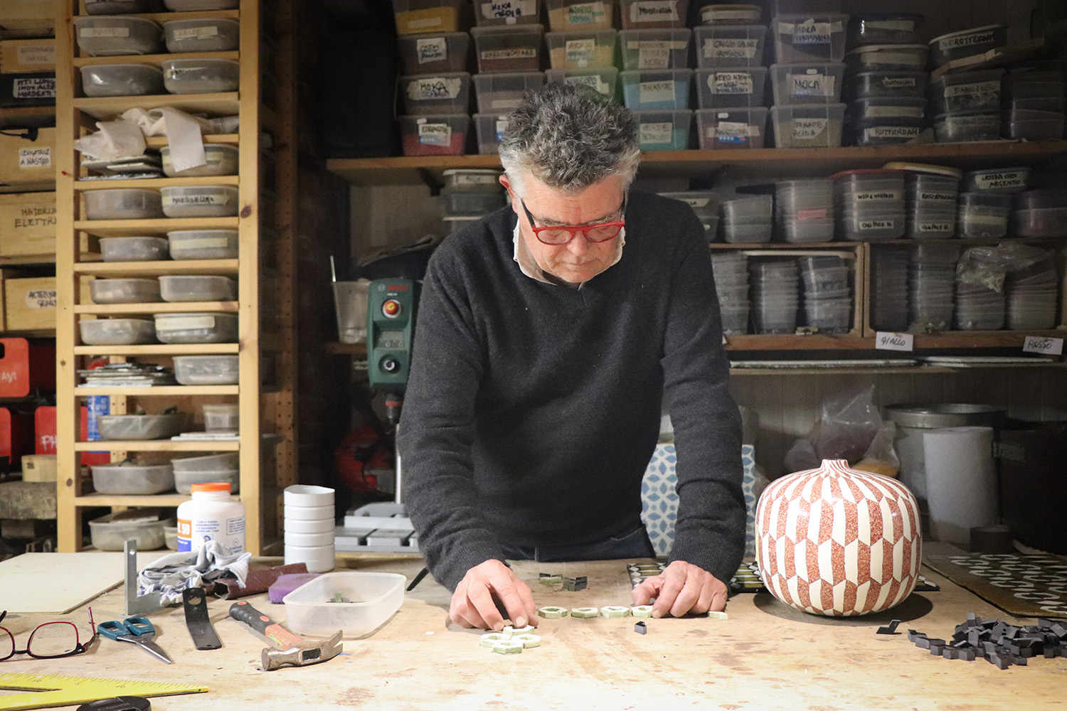
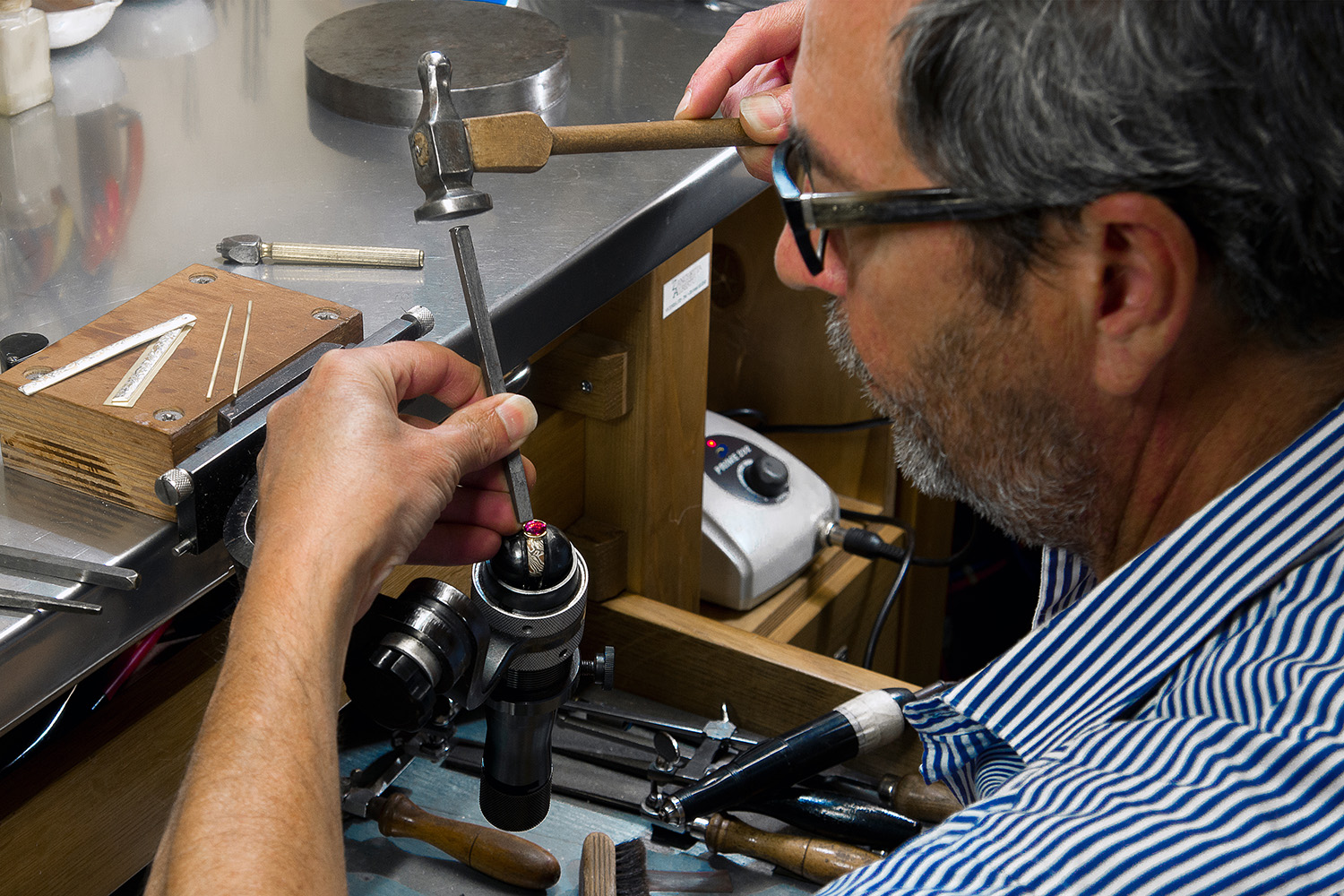
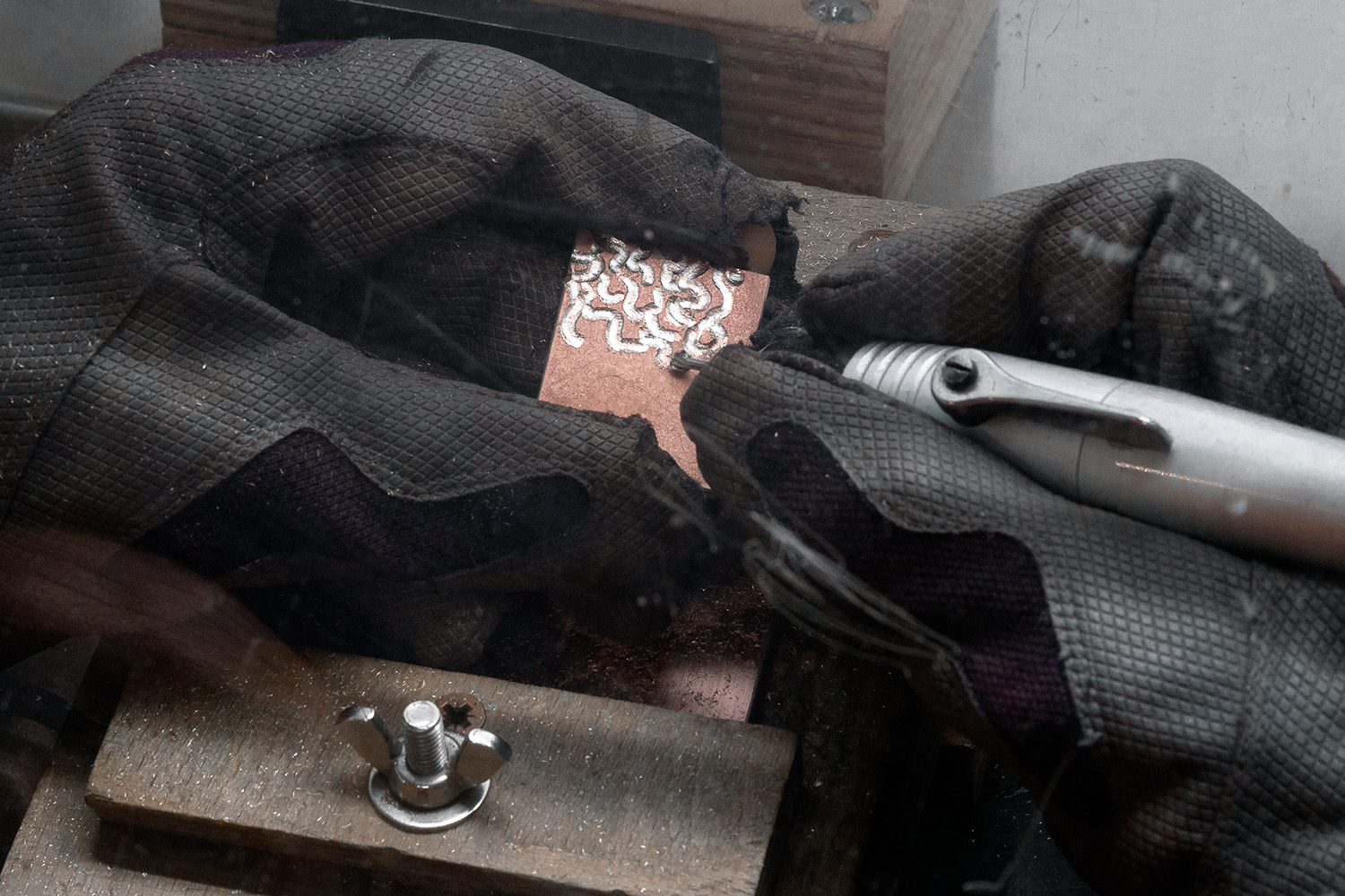
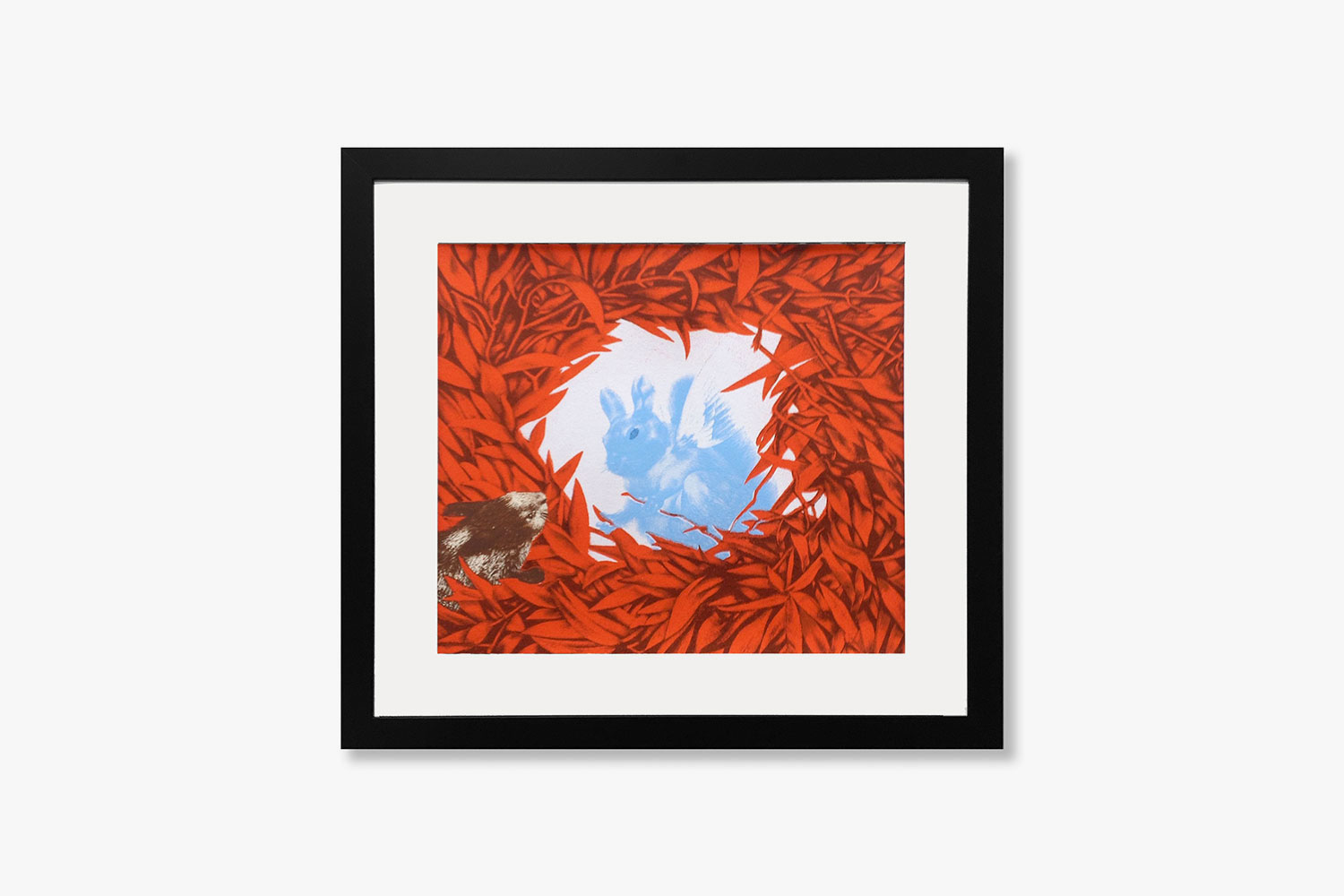
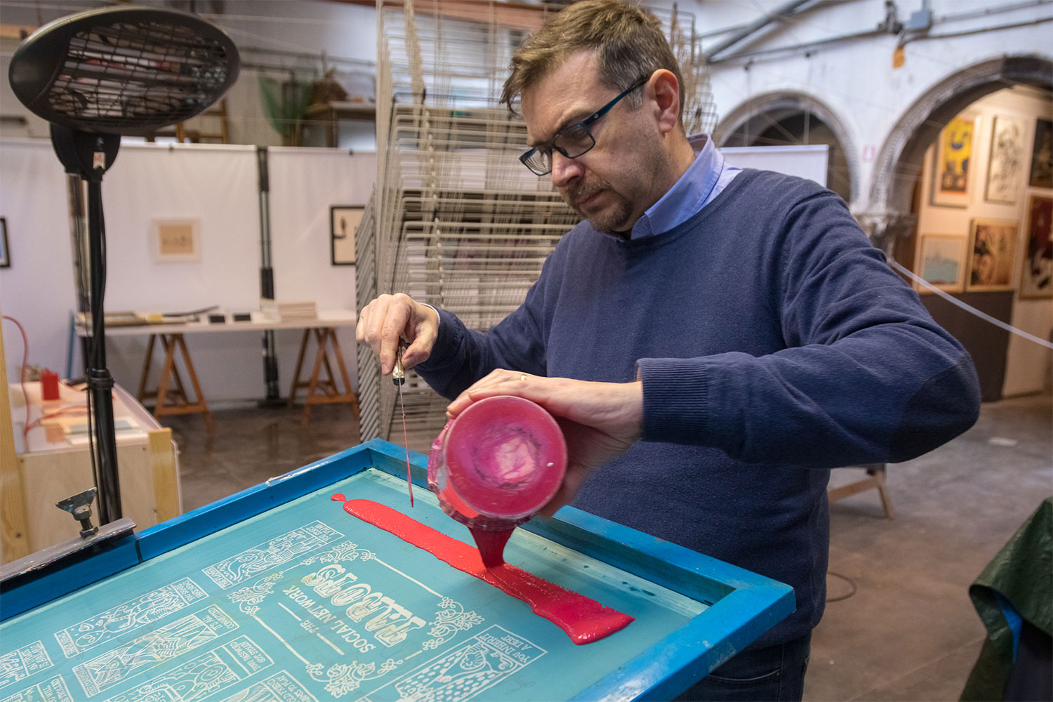
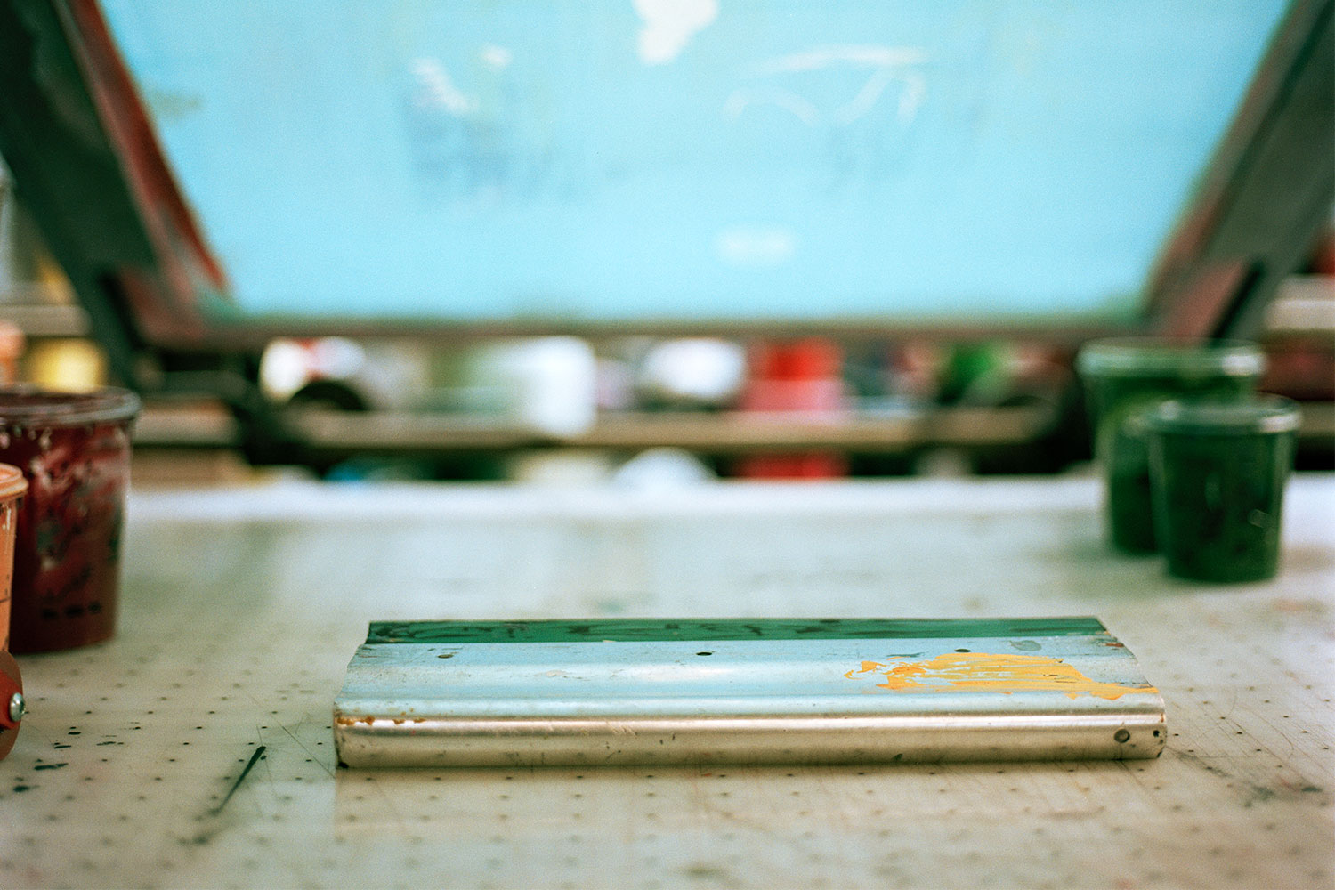
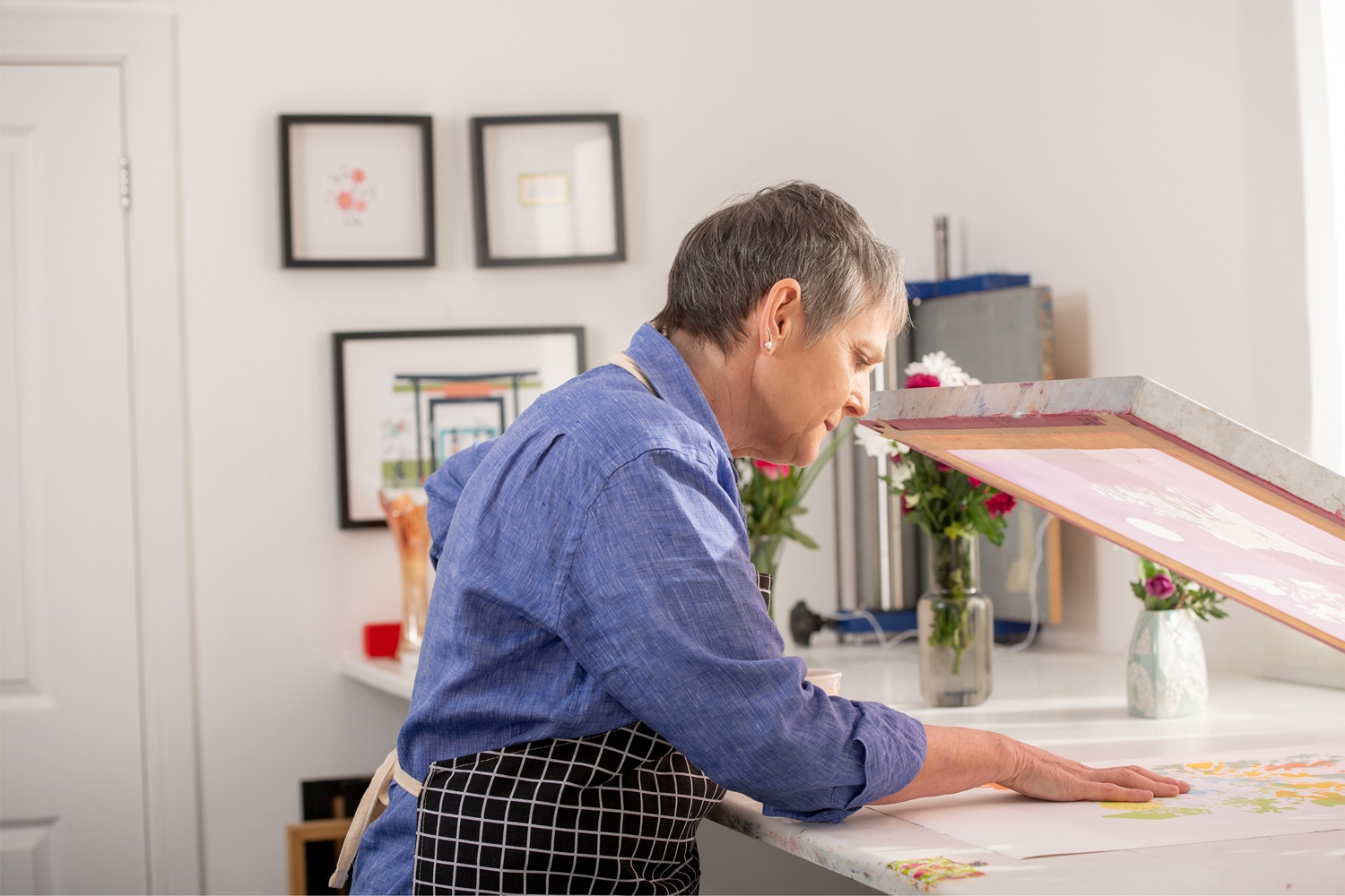
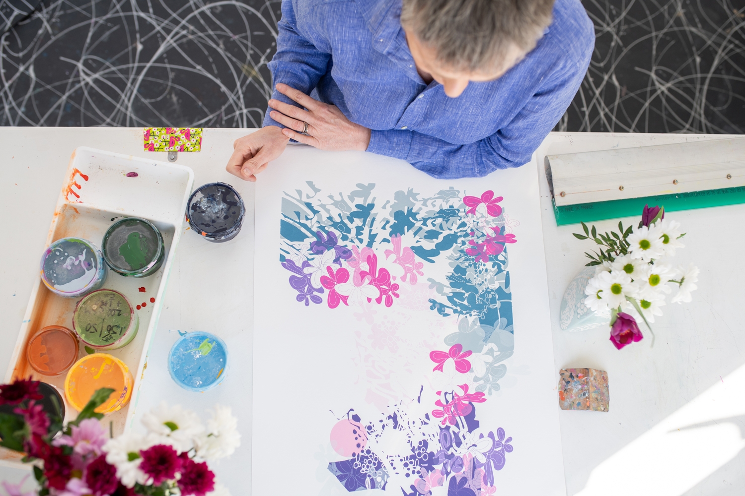
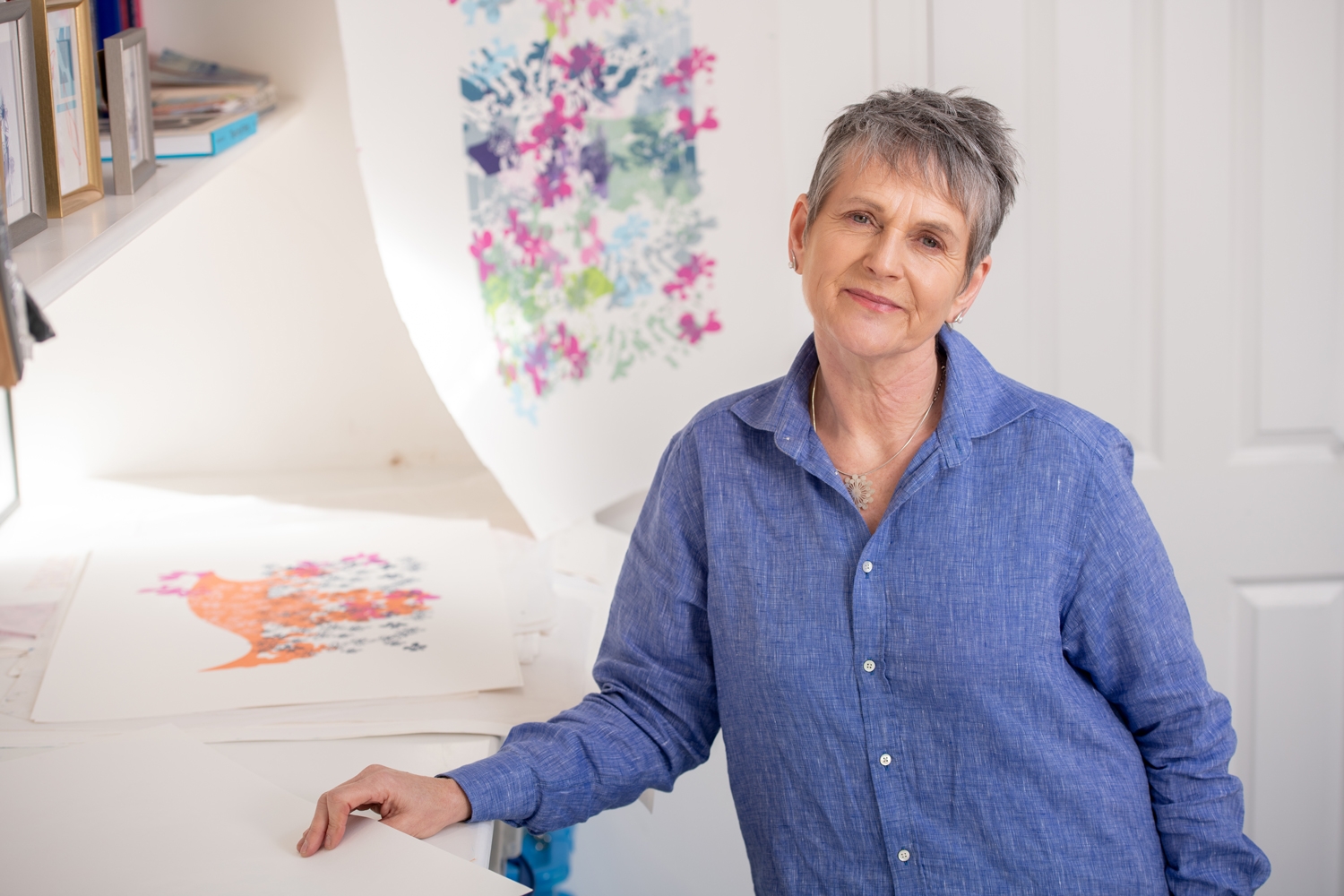
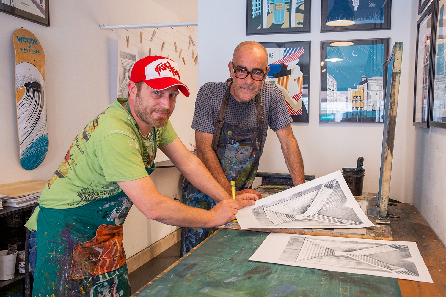
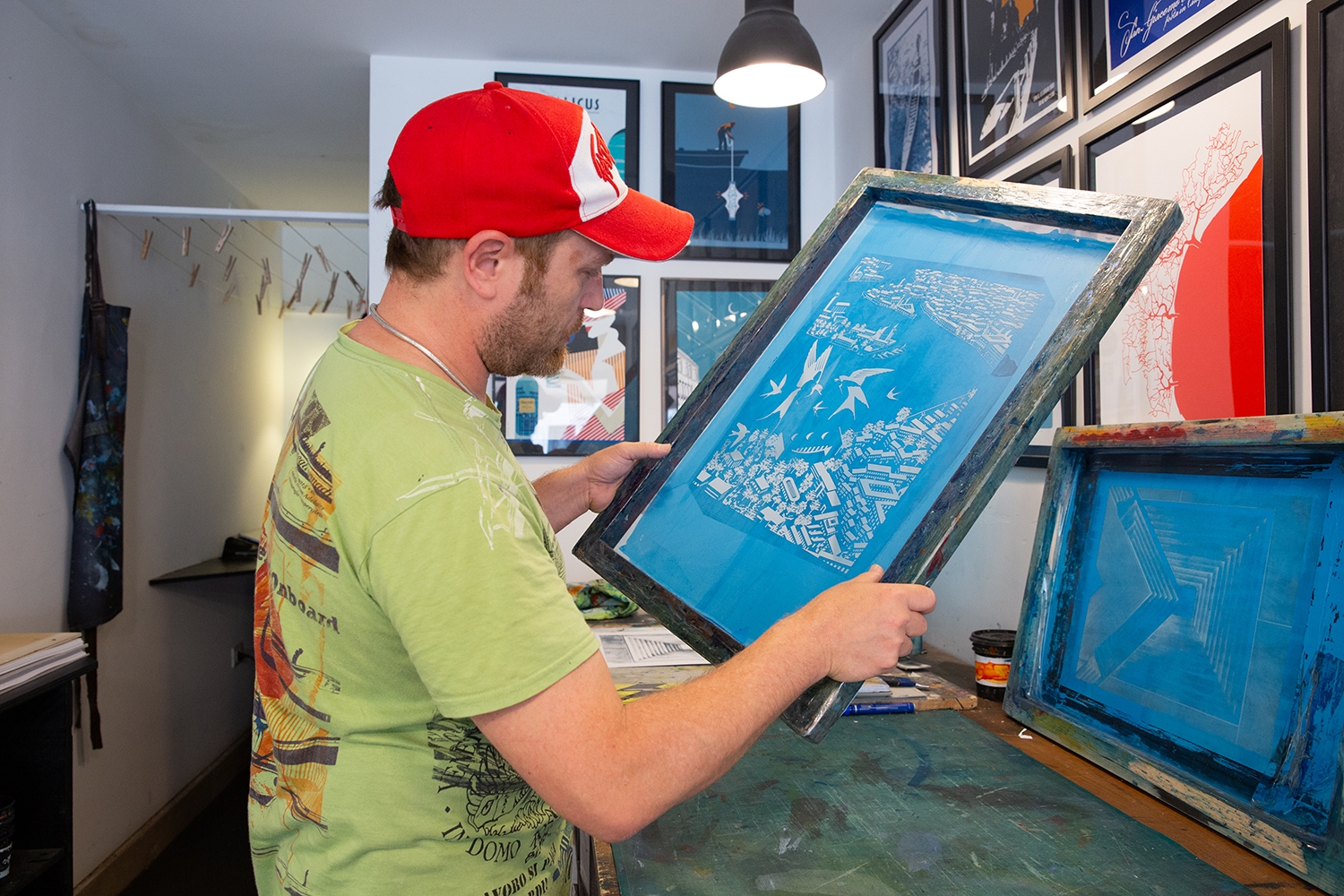
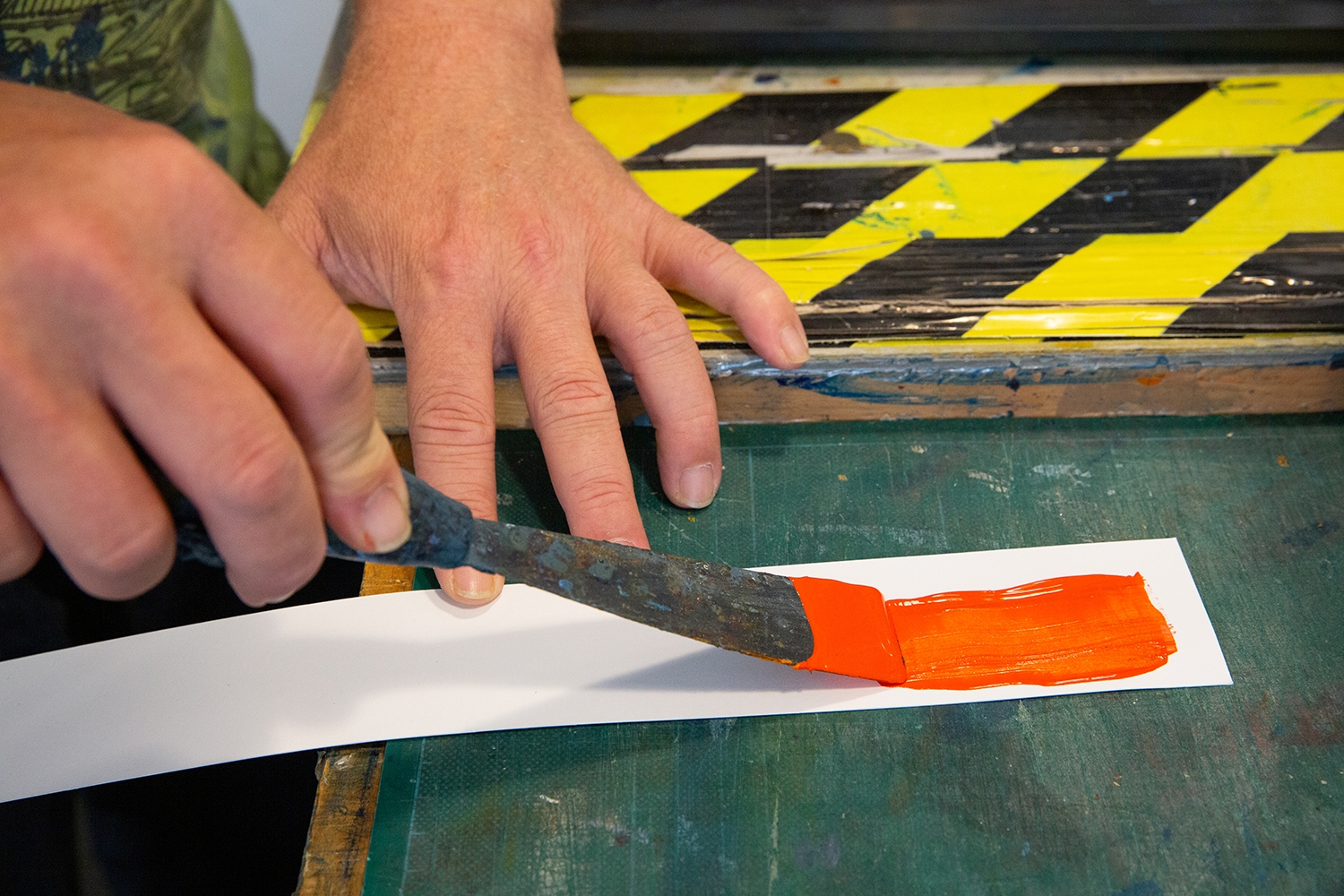
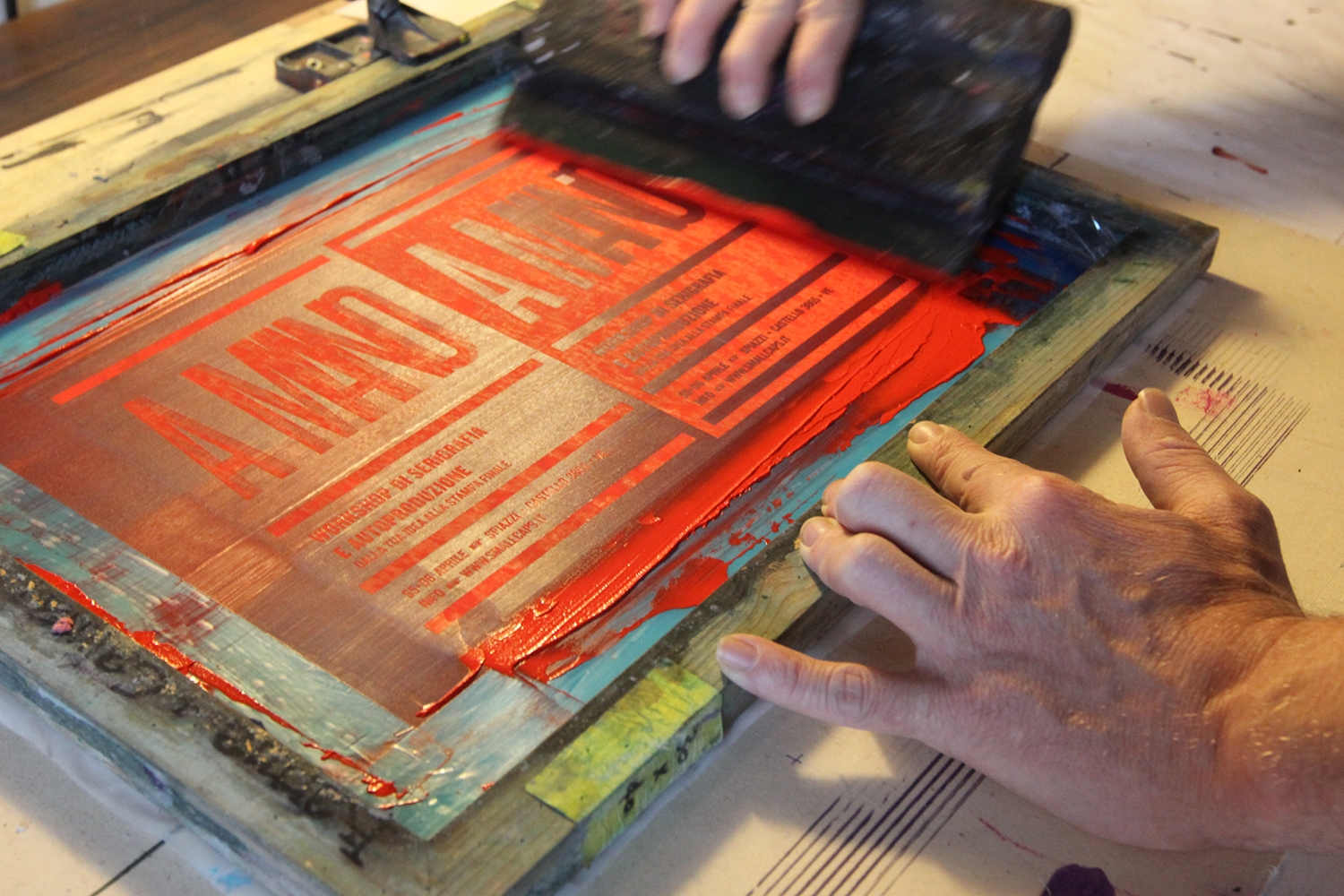
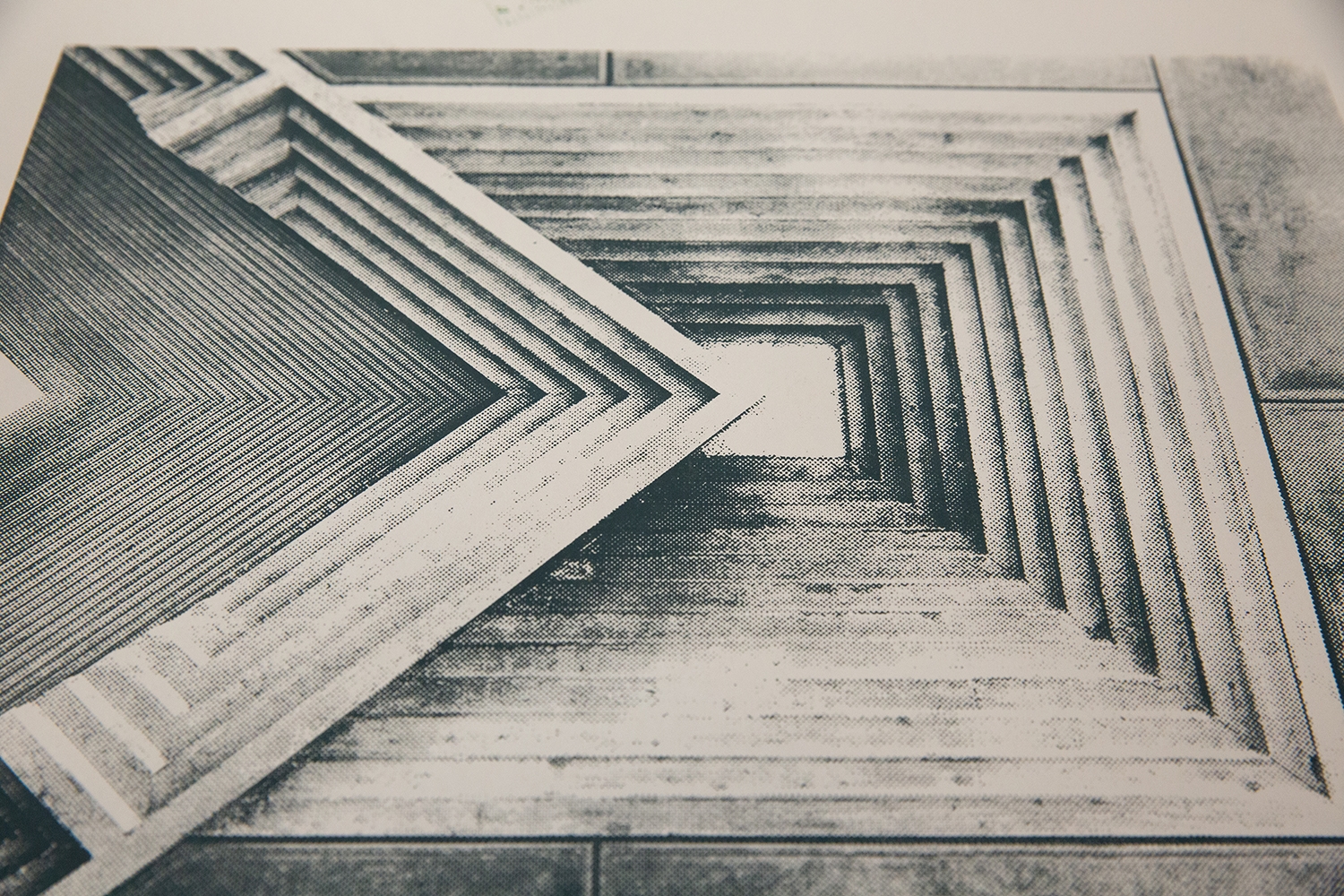
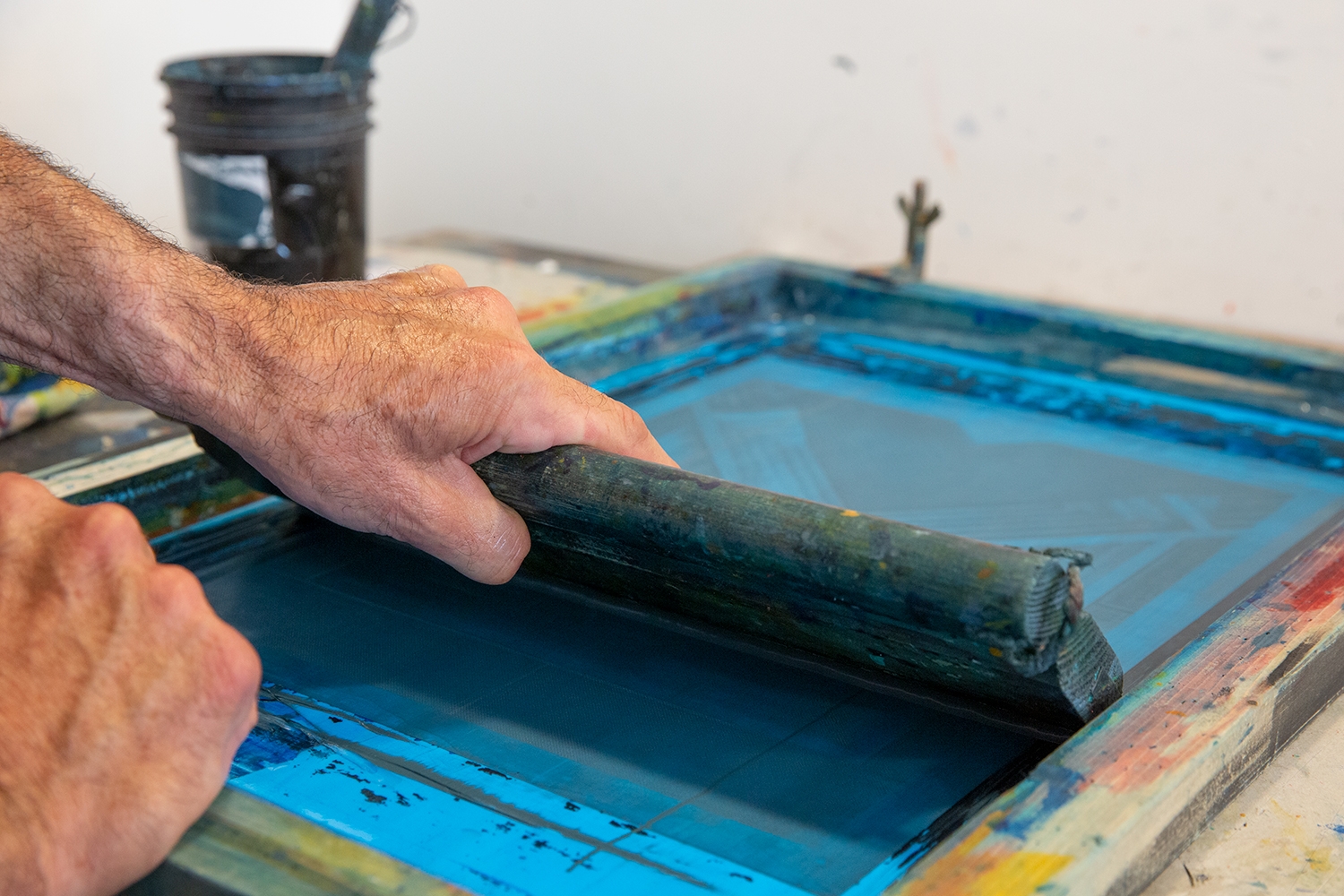
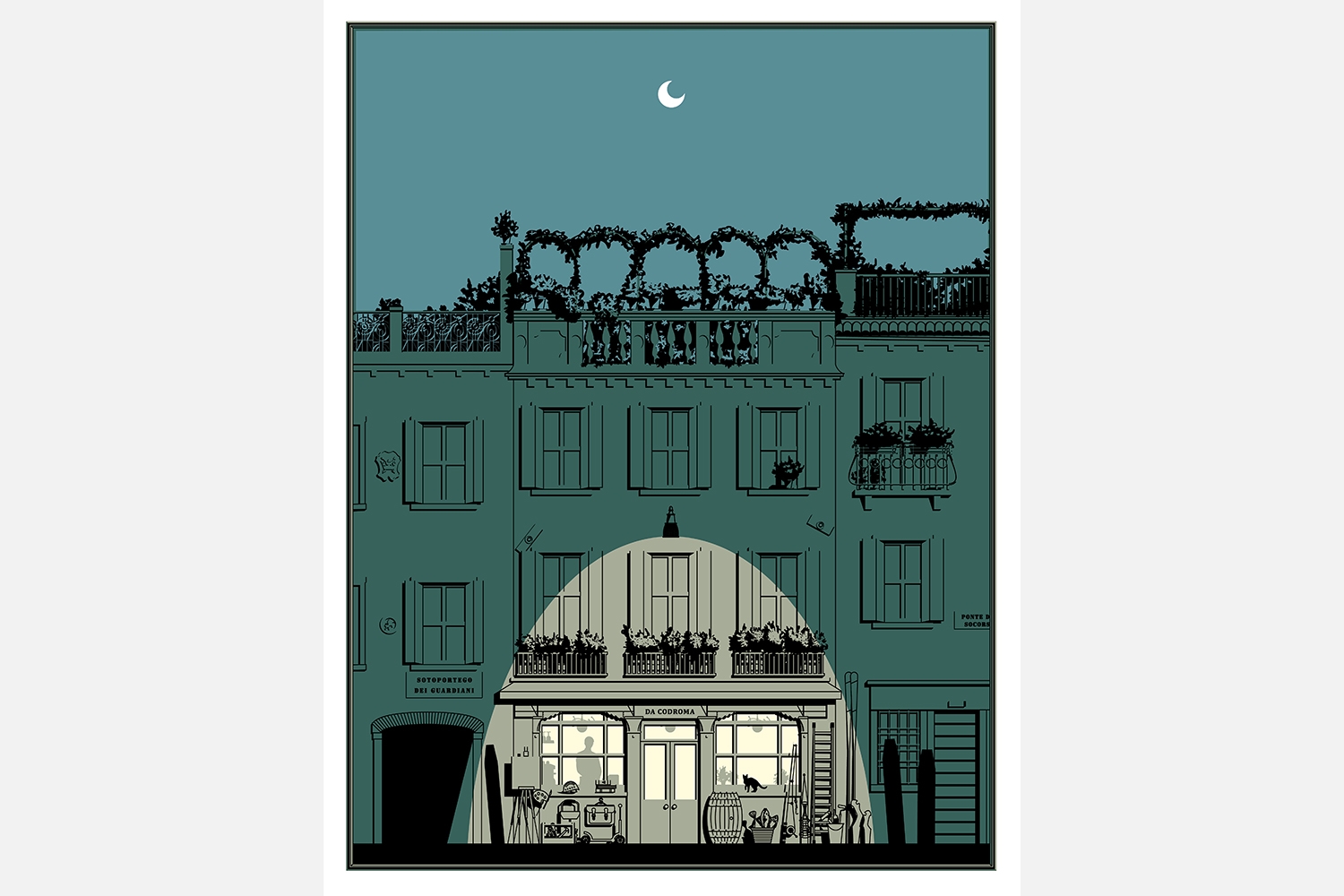
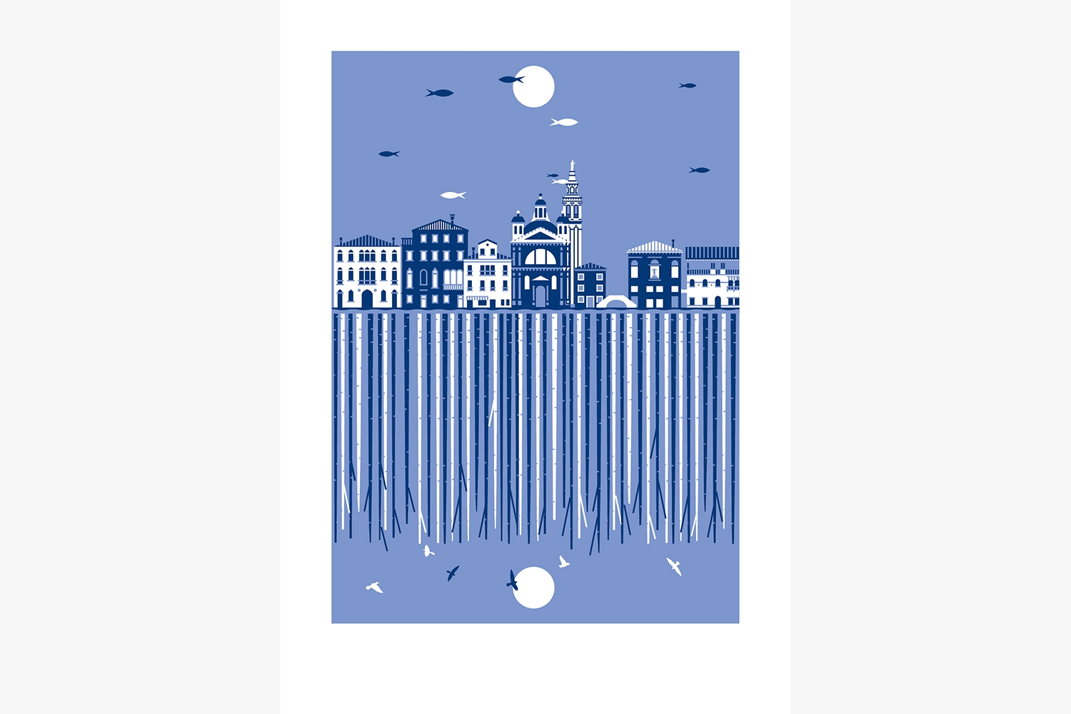
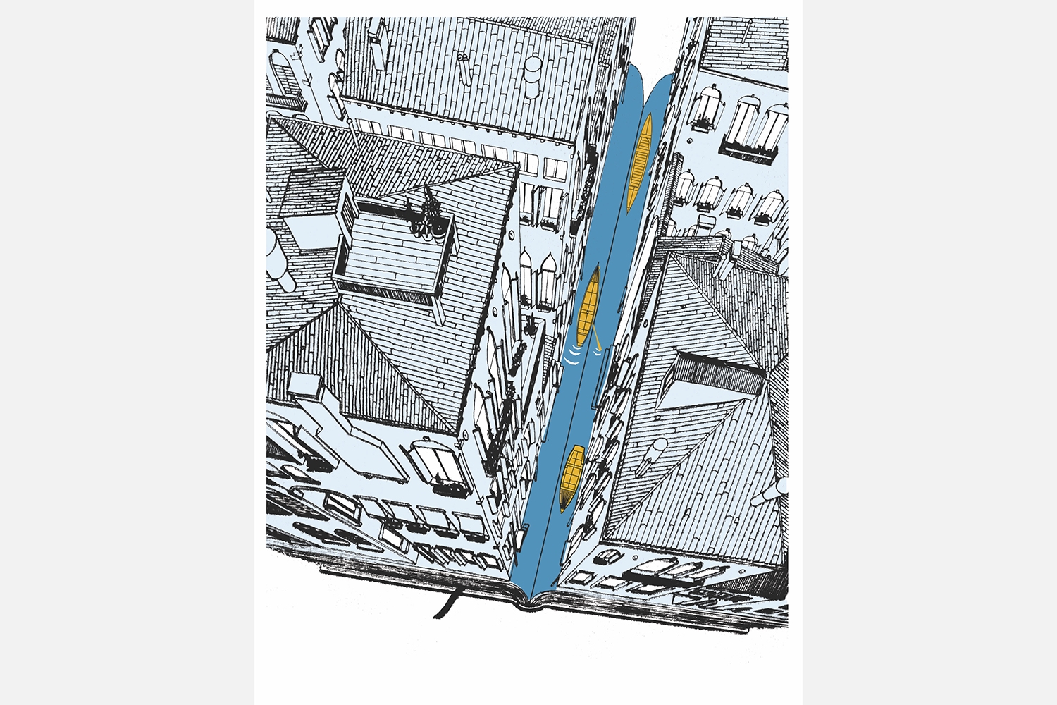
Paolo Roggero and Federico Arzenton met in Venice while studying architecture together at university. In 2012 they founded Small Caps, a graphic design and screen printing studio. Their work is split between graphic design, visual communication and personal creations, harnessing both digital and craft skills. They share a passion for paper and typography. In their studio, there are more than one hundred silkscreen illustrations, inspired by life in Venice, depicting a contemporary cross-section of the city with acute irony. Federico and Paolo hone in on issues that are not part of the Venice imagined by tourists. Instead, their work presents the identity and dignity of a living Venice, made up of both wonder and challenges. Thus, the artistic poster becomes a manifesto, not just an object of graphic design. It is a handcrafted print, an intelligent souvenir and a candid tale.
INTERVIEW
Paolo: We are equally involved in every phase. Concept, sketches, definitive designs, production of the print screens, printing and packaging. Some of our characteristics interconnect: Federico has more of an eye for detail and I have a sixth sense when it comes to blending and combining colours.
Federico: The intuition stems from wanting to get a message across, which is then refined in the sketch and discussion phase, in the search for a vision and how to transmit this message. Our focus is not on Venice’s monuments, the city museum and its mass-consumed symbols, rather, we try to recount the territory as a whole, through the lagoon, the smaller islands and the sea.
Paolo: Tough question! Maybe the poster Don’t stop printing. It was created to sum up our approach to graphic design. We made it minimal, as we always do when designing a logo: a single spot colour, 50 identical rectangles and two triangles, for a poster. Less is more!
Federico: We chose to live here. Our children are born here, but we were not. Our relationship with Venice is based on respect for the local area. Through our posters we have discovered that, despite having lived here for decades, we continue to be charmed and inspired by this place.